§ 01
The concept
BÉTON is a fictional brutalist architecture journal, and this site is its Issue 07 laid out as a single continuous spread: cover, editorial, five dossiers with real written abstracts (Habitat 67, the Barbican, Torre Velasca, Boston City Hall, Trellick Tower), surface specimens, an index table, a colophon. The design rule was borrowed from the buildings themselves: hide nothing. The grid that organises the page is visible as 2px black gridlines; the palette is one concrete grey (#d9d7d2), absolute black, and a single signal red (#e33); the radius is zero everywhere, by principle.
§ 02
The actual techniques
The exposed grid is not drawn with borders. Every section is a CSS grid or flex container whose background is black and whose gap is 2px; the grey cells sit on top, so the gaps read as gridlines that always meet perfectly. Nested grids inherit the trick, so every joint on the page is structural.
Block-inversion hovers are two declarations: .inv:hover swaps background and colour, and a .keep-red class pins the signal red so it survives the flip. The concrete swatches invert with filter: invert(1).
Motion is deliberately crude. Scroll reveals measure getBoundingClientRect() on scroll and add a class — IntersectionObserver was tried first and abandoned, because Chromium reports zero intersection for elements pre-hidden with clip-path. Every animation runs on steps() timing — a few hard frames, no easing, like formwork being struck. The marquees are pure CSS: JavaScript duplicates the track once, then translateX(-50%) loops forever. The header odometer prints scroll position as Y+000123, the nav spies the section you are in, and hovering any elevation drawing plots the cursor in sheet coordinates, snapped to an 8-unit module.
All imagery is code. The five building elevations are hand-plotted inline SVG line drawings; the concrete textures are layered CSS gradients; the grain is an inline SVG feTurbulence filter; the barcode is a repeating-linear-gradient. No libraries, no build step, and no image files anywhere in the issue itself (the only PNGs on the whole site are the two process screenshots below) — the issue is one HTML file, one stylesheet, and about 160 lines of vanilla JS. Fonts (Archivo Black, Space Grotesk, IBM Plex Mono) load from fonts.bunny.net.
§ 03
Three passes, screenshotted
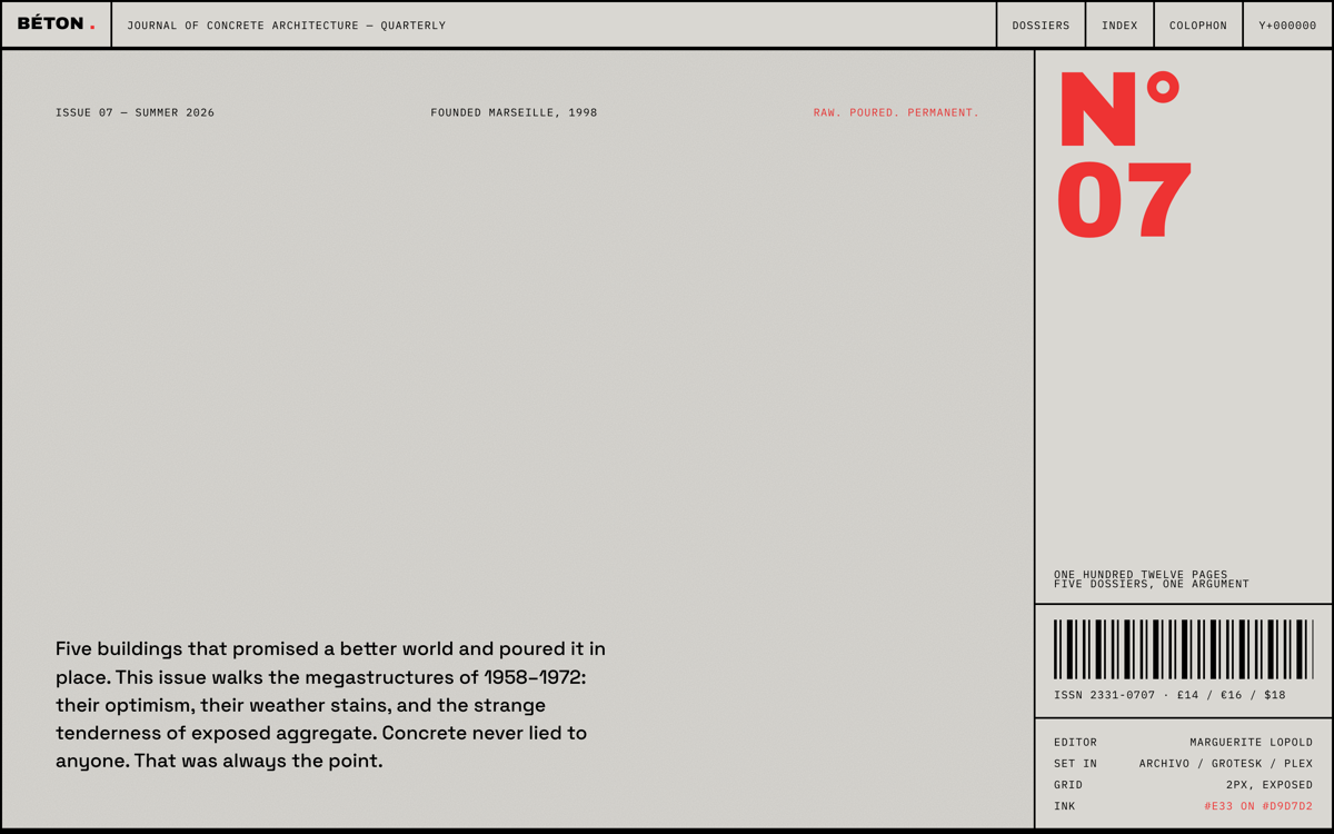
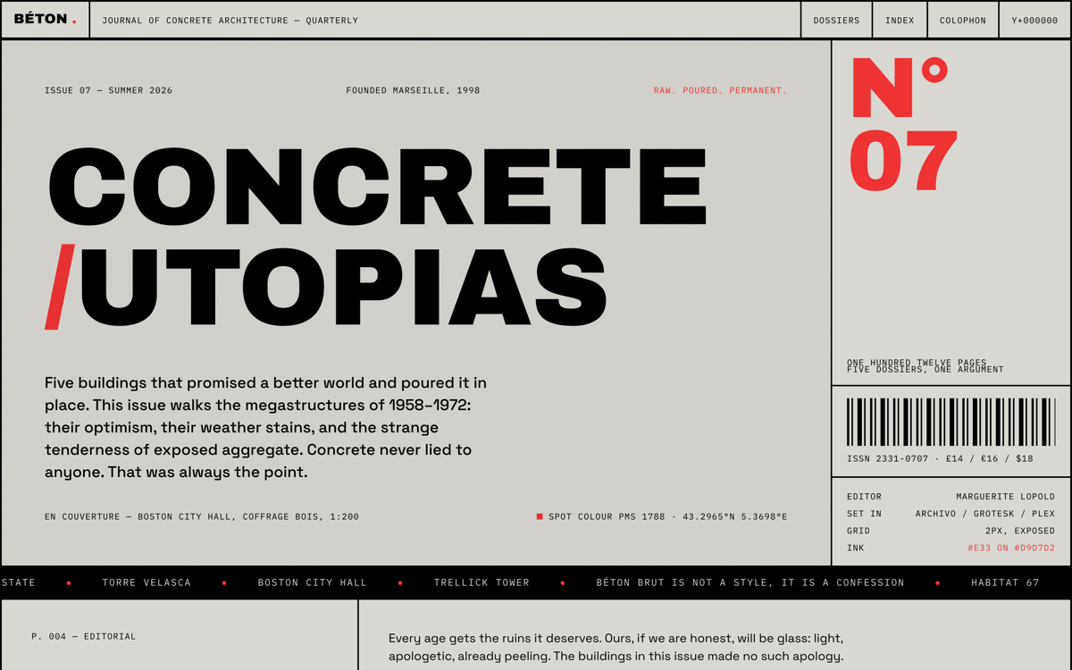
The agent built the page, served it locally, screenshotted desktop and 390px mobile with a headless-Chromium script, then read its own screenshots and critiqued them: font fallbacks, crowding, contrast, clipped cells, dead space. Each pass had to find and fix at least five concrete faults — tightening the folio numerals, rebalancing the cover, hardening the mobile grid — before the next screenshot round. Three full passes, then deploy.
§ 04
How to brief an agent to build this
Give it a magazine, not a website: “Build Issue 07 of a brutalist architecture journal as one static page. Palette: concrete grey #d9d7d2, black, one signal red #e33. Zero border-radius, zero shadows. Expose the grid as 2px gridlines using black grid containers with 2px gaps. Hovering any block inverts it. All reveals use steps() timing. Draw the buildings as inline SVG elevations. Write every abstract for real. Then screenshot yourself three times and fix five faults per pass before you ship.” The last sentence is the one that matters.